
Almost every Excel export from Odoo can be replaced by the built-in pivot or graph view, saved as a one-click favourite that always shows current data. The export survives only for frozen records, outsiders, heavy modelling, and moving data in or out.
Someone needs the numbers, so the routine starts. Export the sales orders to Excel. Export the invoices. Export the stock moves. Build a pivot table by hand, colour a few cells, paste it into an email, and send it round on Monday. By Tuesday the numbers are already a day old, nobody can tell which filter produced them, and next month you do the whole thing again from scratch. The report is not wrong. It is just stale, unrepeatable, and a job that did not need doing.
Most of the time you export to Excel because you have not seen what Odoo already does inside the browser. Almost every list in Odoo can flip into a pivot table or a chart, grouped and measured any way you want, and you can save that exact layout as a favourite so it is one click next month instead of an hour of rebuilding. The data stays live, so the figure you look at is the figure right now. Here is what the pivot and graph views actually do, how grouping and measures work, how to save and share a view so the team stops rebuilding it, when a spreadsheet dashboard is the right next step, and the few cases where exporting to Excel is genuinely the right call.
Why everyone reaches for Excel first
The export habit is not laziness. It is what people learned before Odoo, and the Odoo reporting tools are one click off the screen most people stare at all day. A few reasons it sticks.
The list view looks like the only view. You open Sales and you get a list of orders. It does not shout "I can become a pivot table". So you do what you know: export the list and pivot it in Excel, because that is where you have always pivoted things.
Nobody showed you the view switcher. The buttons that flip a list into a pivot or a graph sit in the top right corner and are easy to miss. If you have never clicked them, you do not know the live pivot exists, so you rebuild it by hand every time.
You think the report has to be "made" somewhere else. There is a belief that real reporting happens in a separate tool: Excel, Power BI, a BI platform. So even when Odoo has the answer on screen, the instinct is to pull the raw data out and build the report somewhere "proper".
The filter you used is in your head, not saved. You filtered to this quarter, this team, this product category, and got the right answer. Next month you have to remember exactly what you clicked. Excel at least freezes the result, so it feels safer than trusting yourself to rebuild the filter.
None of these are good reasons once you have seen the alternative. They are just habits formed before the tool changed.
What the pivot and graph views actually do
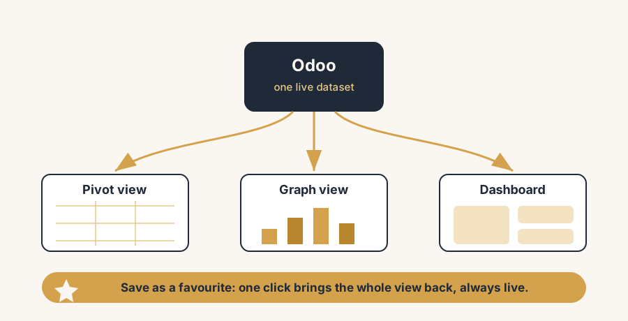
Odoo has two built-in analysis views that sit on top of almost any list of records: the pivot view and the graph view. You reach both from the view-switcher icons in the top right of any list. They read your live data, so there is nothing to export and nothing to refresh by hand.
The pivot view turns a flat list into an interactive pivot table, right in the browser. You pick what goes down the rows, what goes across the columns, and which numbers fill the cells. Sales by salesperson down the side, by month across the top, revenue in the cells. Click the plus on any row or column to drill one level deeper, from year to quarter to month, from category to product. It does live what you were doing by hand in Excel, and it never goes stale because it reads the database every time you open it.
The graph view turns the same data into a chart: bar, line or pie. Bars compare categories side by side, lines show a trend over time, pie shows how a whole splits into parts. It is the same underlying data as the pivot, shown visually, and it is the fastest way to spot the shape of something before you dig into the exact figures.
Both views exist on the standard reporting screens (Sales > Reporting, Inventory > Reporting, Accounting > Reporting, and so on) and on most ordinary list screens too. You do not need a separate BI tool to answer "revenue by month per salesperson" or "stock value by category". It is two clicks from the list you already have open.
The fix, in numbered steps
Replace the export-and-rebuild routine with a live view you save once. The steps build on each other.
Switch the list to a pivot or graph instead of exporting it.
On any reporting or list screen, use the view-switcher icons in the top right to flip from the list to the pivot table or the graph. This is the move that kills most exports: the analysis you were going to do in Excel, you now do on live data in the browser. Start with the pivot when you want exact numbers, the graph when you want the shape.
Group your data with Group By, on rows and on columns.
In the pivot, the plus icons next to a row or column header let you group by any field: by salesperson, by month, by product category, by customer. Group on the rows for one dimension and on the columns for another, and you get a true cross-tab. This is the same thing you built manually in an Excel pivot, except Odoo already knows the relationships in your data, so a few clicks gets you there.
Choose your measures, and add more than one.
Measures are the numbers in the cells: amount, quantity, count, margin, whatever the model offers. Open the Measures menu and tick what you want. The pivot view lets you show several measures at once (revenue and quantity and count side by side), which the graph view does not. Pick the measures that answer the actual question, not every number available.
Save the view as a favourite so next month is one click.
Once the pivot or graph shows exactly what you need, open the Favorites menu and choose Save current search. Give it a clear name. Now the filter, the grouping and the measures are stored together, and reopening the report is one click instead of a rebuild. Tick the default-filter option if you want this view to load automatically every time you open that report.
Share the view, do not re-export it.
A saved favourite can be shared with the team so everyone opens the same definition of "monthly sales by rep" instead of five people exporting five slightly different spreadsheets. For a standing report that several people watch, insert the pivot into an Odoo spreadsheet and turn it into a dashboard (next section), so the live figure is on a shared screen, not in an attachment that is out of date the moment you send it.
Spreadsheet dashboards: when you do want a spreadsheet, keep it live
Sometimes you genuinely want a spreadsheet: you need to add a calculated column, combine a pivot with a target, or lay several reports out on one page. The trick is to keep it connected to Odoo instead of exporting a dead copy.
From any pivot or graph view, use Insert in spreadsheet. Odoo drops the pivot or chart into an Odoo spreadsheet that stays linked to your live data. You can add formulas and extra columns around it like any spreadsheet, but the underlying figures refresh from the database (when you open the file, reload, or hit Refresh all data), so the spreadsheet does not rot the way an exported xlsx does.
When you insert a pivot you get a choice. A static pivot writes one formula per cell, a snapshot you can do column maths on but that will not grow with new months or adapt if you regroup. A dynamic pivot uses a single connected data source that auto-updates with new data and adapts to new groupings and filters. Use dynamic when the report is a standing one that should keep growing; use static when you want a fixed snapshot to calculate against.
Those Odoo spreadsheets are the foundation of Odoo Dashboards. You can pin several pivots and charts onto one dashboard page so the team gets a live overview of the metrics that matter, all reading from the same database, all current. That is the real replacement for the Monday email: a shared dashboard everyone can open, not a spreadsheet you rebuild and resend.
The part that trips people up
A few things catch almost everyone
A few things catch almost everyone moving off the export habit.
The view switcher only shows views the screen supports. Some custom or simple list screens do not have a pivot or graph view enabled, so the icons are not there. The standard Reporting menus (Sales, Inventory, Accounting, CRM and the rest) always have them, so start there rather than on a raw list if you cannot find the pivot.
Measures only offer fields that make sense to total. You can only measure numeric fields the model exposes (amounts, quantities, counts). If the number you want is not in the Measures list, it is usually because it is not a stored numeric field on that model, or it needs a different reporting model. That is a configuration question, not a missing feature.
A saved favourite saves the search, not a frozen result. This is the point, but it surprises people: reopen the favourite next month and it shows next month's data through the same filter and grouping, not last month's numbers. If you need last month frozen forever, that is the one case where an export or a static spreadsheet snapshot is right.
Static and dynamic pivots behave very differently in a spreadsheet. People insert a static pivot, add a new month of orders, and wonder why the new column never appears. Static is a snapshot by design. If you want it to grow, insert it as dynamic. Choosing wrong here is the most common spreadsheet-dashboard mistake.
Group By order matters in a pivot. Grouping by salesperson then month reads differently from month then salesperson, and one of them answers your question better than the other. If a pivot looks confusing, the grouping order is usually why. Swap the row and column groupings and it often clicks.
When exporting to Excel is actually the right call
Live views beat exports for almost everything, but not for everything. Export to Excel when:
- You need a frozen point-in-time record, for example a month-end figure that must never change even as the underlying data does.
- You have to hand the data to someone outside Odoo who has no access and just needs the file.
- You need to do heavy modelling, complex what-if scenarios, or maths that genuinely belongs in a spreadsheet and not in a report.
- An auditor, accountant or authority asks for the raw data in a file.
- You are moving data in or out of Odoo. For imports and bulk updates a spreadsheet is the right tool, and with an external ID column the same file becomes safely re-importable; we covered that mechanism in fixing the external ID errors when you import data into Odoo.
For everything else (the weekly sales pivot, the stock-by-category view, the open-invoices-by-customer chart) the live view or a connected spreadsheet dashboard is faster, never stale, and not a job you redo every month.
Quick checklist
- You flip lists into the pivot or graph view from the top-right icons instead of exporting them.
- You group on both rows and columns with Group By to get a real cross-tab.
- You add the measures that answer the question, using more than one in the pivot when useful.
- You save the view as a named favourite so reopening it is one click, not a rebuild.
- Standing reports live as a shared spreadsheet dashboard connected to Odoo, not as a Monday email attachment.
- You insert pivots as dynamic when they should keep growing, static when you want a fixed snapshot.
- You only export to Excel for frozen records, outside parties, heavy modelling, or an auditor's request.
FAQ
How do I create a pivot table in Odoo without exporting to Excel?
Open any reporting or list screen, then click the pivot view icon in the view-switcher in the top right. Odoo turns the live data into an interactive pivot table in the browser. Use the plus icons on the rows and columns to group by fields like salesperson, month or product category, and open the Measures menu to choose which numbers fill the cells. You can show several measures at once. The pivot reads your database every time you open it, so there is nothing to export and the figures are always current.
What is the difference between the pivot view and the graph view in Odoo?
The pivot view shows your data as a numeric cross-tab table that you can group on rows and columns and drill down into, and it can display several measures at the same time. The graph view shows the same data as a chart (bar, line or pie) for spotting trends and comparisons at a glance, but it shows one measure at a time. Use the pivot when you need exact numbers and multiple measures, the graph when you need to see the shape of the data quickly. Both read live data from the same records.
How do I save and reuse a report layout in Odoo?
Set up the pivot or graph the way you want (filters, grouping and measures), then open the Favorites menu and choose Save current search. Give it a clear name and it is stored with all its settings, so reopening it next month is one click instead of rebuilding. Tick the default-filter option to have that view load automatically when you open the report. A saved favourite stores the search definition, not a frozen result, so it always shows current data through the same lens.
Can I build a live dashboard from Odoo data instead of emailing a spreadsheet?
Yes. From any pivot or graph view, use Insert in spreadsheet to drop it into an Odoo spreadsheet that stays linked to your live database, then pin several of those onto an Odoo dashboard. The figures refresh from the database when the page is opened or reloaded, so the whole team watches one current view instead of a spreadsheet that is out of date the moment you send it. Insert pivots as dynamic if they should keep growing with new data.
When should I still export Odoo data to Excel?
Export when you need a frozen point-in-time record that must never change, when you have to give the data to someone with no Odoo access, when you need heavy modelling or what-if scenarios that belong in a spreadsheet, or when an auditor or authority asks for the raw file. For routine recurring reporting (weekly sales, stock by category, open invoices) a live pivot, graph or connected dashboard is faster and never goes stale, so the export is the exception, not the default.